Creating a rebrand for the biggest domestic trophy in powerchair football.
Methods partnered with the Wheelchair Football Association (WFA) to reimagine the John Good Group WFA Cup, giving the tournament a brand that matches the pace, precision and growing popularity of powerchair football.
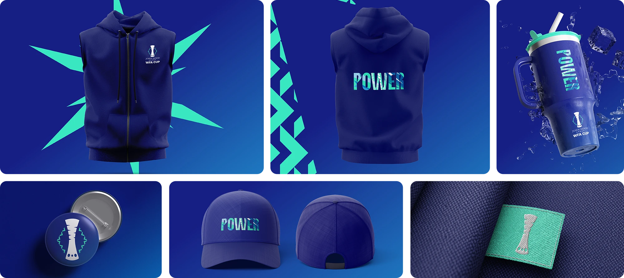
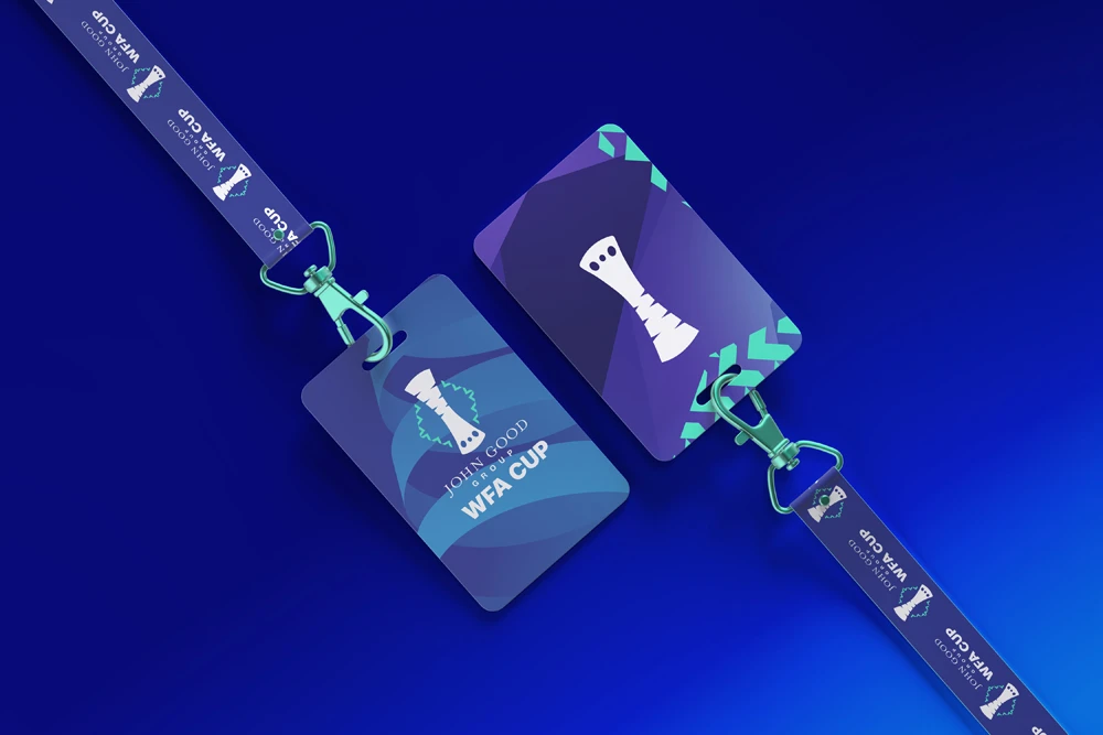
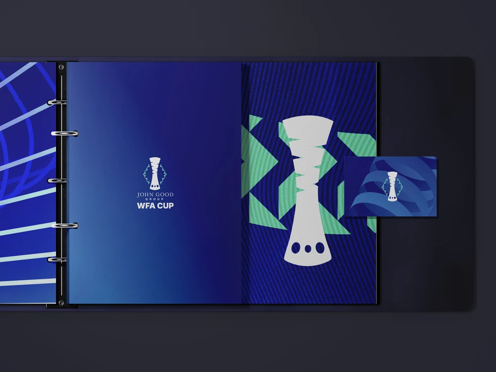
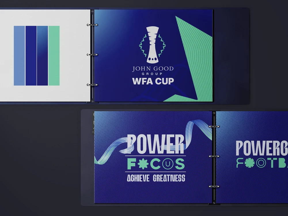
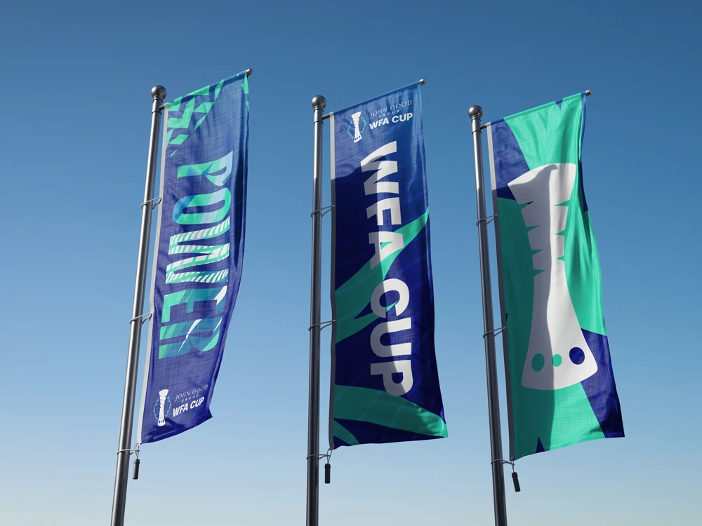
The rebrand was a full overhaul, from refreshed positioning through to a tightly connected suite of visual assets designed to attract new supporters and build a bigger following over the years ahead.At the heart of the identity is a story of energy, vibrancy and speed. Every element was designed to capture the feeling of a match: quick turns, rapid transitions and that unmistakable moment when a game swings on a split-second decision.
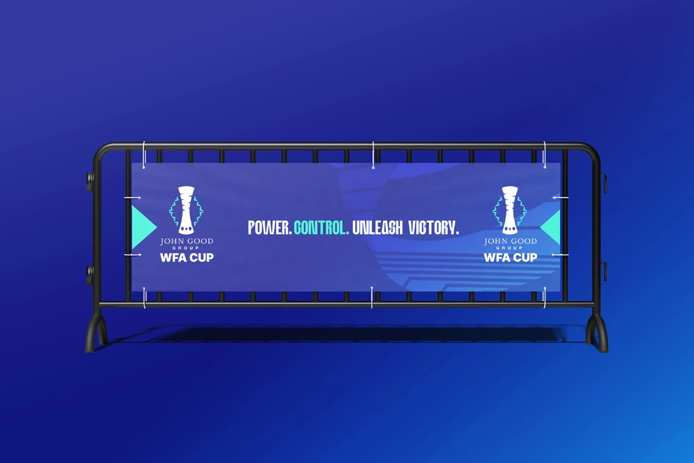
The system translates brilliantly across digital, social, event spaces and broadcast, ensuring the Cup looks modern, confident and instantly recognisable wherever it appears.
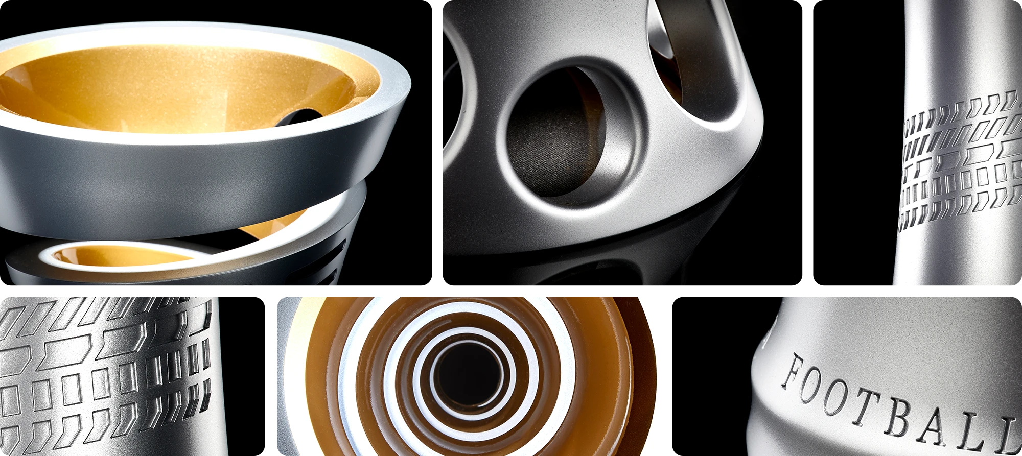
A defining moment of the project was the new trophy design. Built to be distinctive on screen and in the arena, it creates a genuinely iconic symbol for the competition and a focal point for players, fans and partners.For Methods, this project was personal. The WFA team’s passion is infectious, and the rebrand reflects their ambition and the impact they deliver together.